

Case Study // 2023
Soulitude Branding
Detailed process from idea to finished project


Goal
“Soulitude stems from a deep desire to bring quality and add value to the Christian community, addressing in a biblical and professional manner a very important theme, which is rest. Soulitude is a fusion of "soul" and "solitude" in which the aim is to promote rest for Christians (individuals, couples, and families) with a focus on investing in their relationship and intimacy with God.

Quick Picture
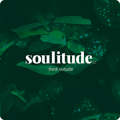

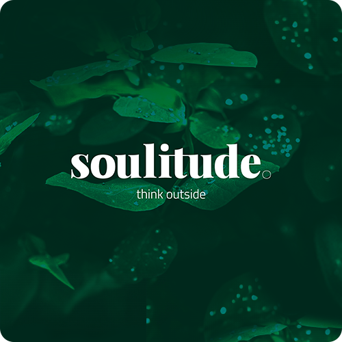

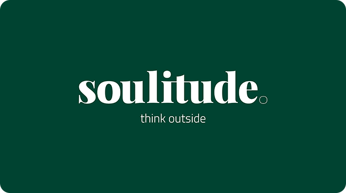
Illustrative Banner

Creative Process
First Step
Typo & Color
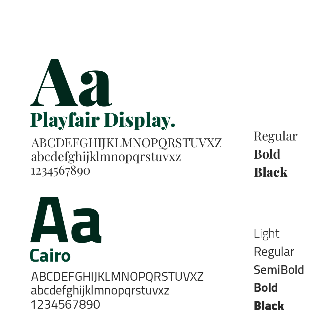 Typography
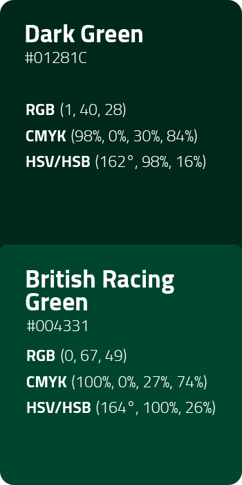
Soulitude arises from the combination of two typefaces, Playfair Display (with a dynamic appearance, although quite formal) and Cairo (a versatile variant with various application potentials). The colors are inspired by the surrounding nature, green spaces, and contemplation.
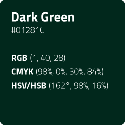
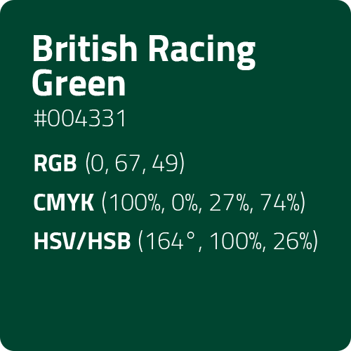
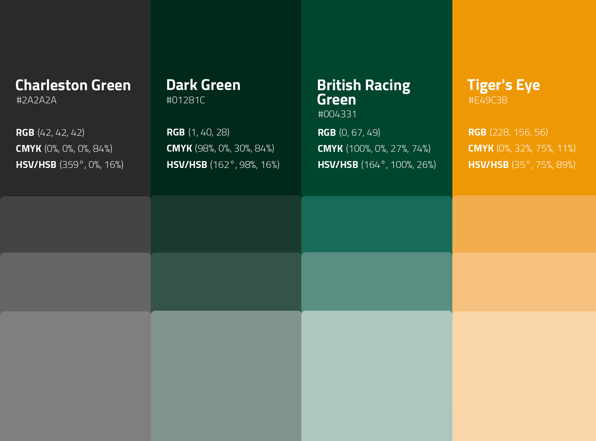 Color Palette
Second Step
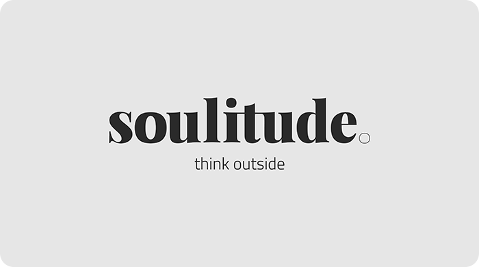
Logo
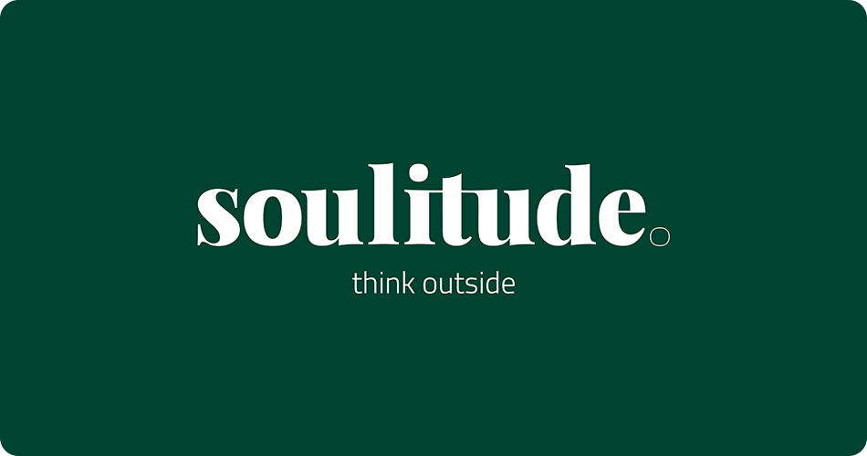
 Horizontal Dark Logo
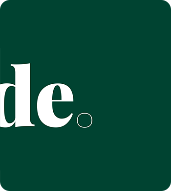 >
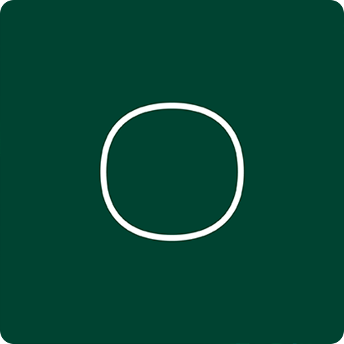
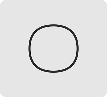
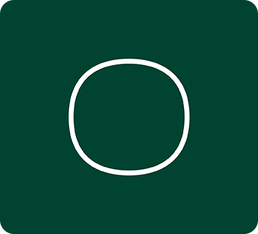
Dark Icon Detail
>
Dark Icon Detail
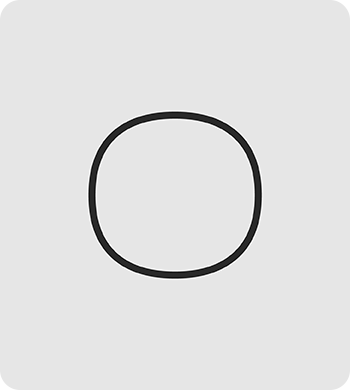
 Dark Icon
The dark version of the logo should should evoke the colors of natural elements. The green represents the forest. Intended to be placed on banners, posts and among other graphic content.
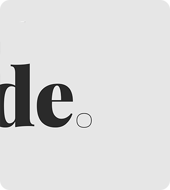 Light Icon Detail
 Light Icon
 Horizontal Light Logo
The light version of the logo aimed to convey a greater sense of lightness, serving as a support for various needs. It is a versatile alternative to the primary option (the dark one).
Thrird Step
Mockups
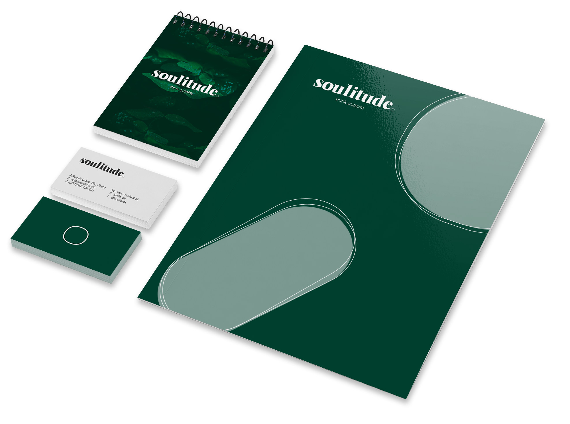
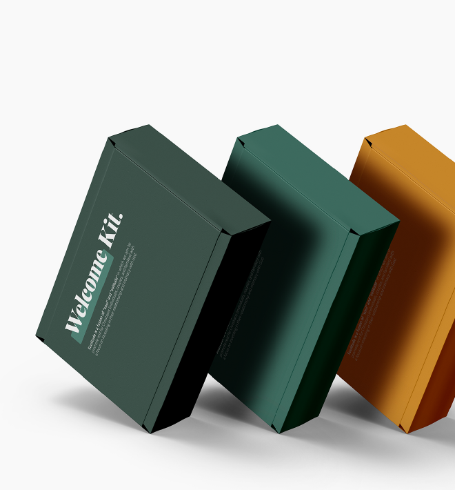 Welcome Kit
Each person who benefits from Soulitude's practical programs will be given a welcome kit, along with a piece of clothing that reflects the brand.
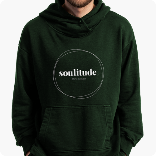
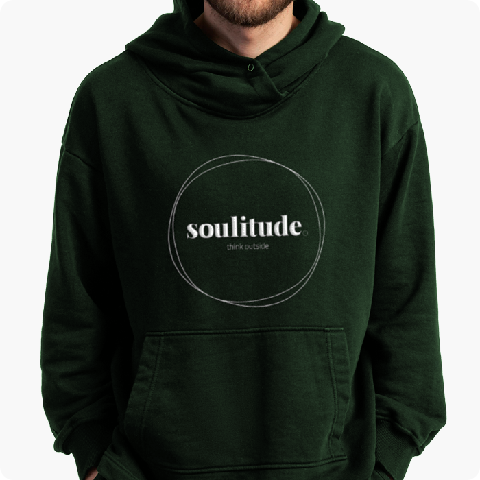
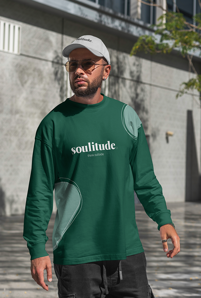 Merchandising
*iMessage, FaceTime Audio and FaceTime video available.
*iMessage, FaceTime Audio and FaceTime video available.